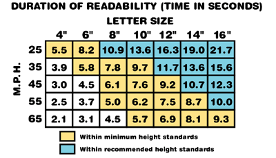
Readability Index

The times in seconds are calculated assuming a 1" letter to be readable at 50 feet. Each 1" increase results in an additional 50 foot readability. By industry studies, the 50 foot per inch readability criterion is generous.
The chart (right) also assumes free flowing traffic. Traffic lights, stop signs, and other conditions can, in some cases, justify smaller character height.
Remember, the figures in the chart represent the time from which letters first become readable until one passes the sign. They are the maximum. The need to monitor traffic conditions, and standard driving concerns, plus other visual competitors, will restrict the amount of time a driver can dedicate to reading your message. The answer, whenever possible, is to allow the driver more time to read the message through larger letter sizes.
The premier quality of an effective sign is readability. If a sign cannot be read from a distance sufficient to allow time to read it, then the message it carries is silenced. The chart will help you choose the best letter size for the speed of traffic passing by.
From years of study, it has been determined that the minimum reading time is 5 seconds, 10 seconds is recommended when possible.
Other design aspects such as Color, Contrast and Spacing will also effect readability. See Graphic Design Tips for details.
*Document courtesy of Gemini, Inc.
